University of Washington
UX-Driven Content Redesign
Project Overview
As Web Content Specialist for the University of Washington’s Foster School of Business, I led a content governance and redesign initiative focused on the Writing Skills Assessment (WSA)—a required component of the undergraduate admissions process.
The WSA registration experience had become a recurring source of confusion for prospective students, generating hundreds of annual inquiries to the admissions office. In partnership with the Undergraduate Admissions team, I spearheaded a research-informed redesign aimed at clarifying complex instructions, restructuring information architecture, and improving overall usability without altering the underlying registration systems.
The project focused on strengthening content clarity, institutional consistency, and navigational flow within a high-stakes admissions touchpoint.
Challenges
The initiative required navigating several structural and organizational constraints:
Complex Registration Infrastructure: The process relied on multiple portals hosted across separate university platforms, segmented by campus location and accommodation type. While the workflow itself could not be modified, the website needed to clearly guide users through these pathways to reduce friction.
Limited Governance Visibility: The WSA web pages had historically received minimal oversight, and key stakeholders lacked shared awareness of structural issues. Aligning teams around the importance of improving this experience required surfacing user pain points and reframing the project’s institutional impact.
Legacy Content Debt: Broken elements, inconsistent labeling, and poorly organized resources created avoidable barriers for prospective students. Addressing these issues required a comprehensive audit and systematic content restructuring.
My Role and Approach
Content Governance
My work began with a comprehensive content audit of the Foster School’s existing undergraduate admissions web experience. I evaluated site structure, clarity, and information accessibility to identify outdated resources, broken links, mislabeled assets, and gaps in how key admissions steps were communicated.
As the primary web content producer supporting this initiative, I was responsible for strengthening both the user experience and the institutional consistency of admissions content. My focus included:
Identifying structural and informational breakdowns across the admissions journey
Partnering with the Undergraduate Admissions team to implement clearer, governance-aligned content updates
Rewriting and restructuring copy to improve accessibility, navigation, and comprehension for prospective students
Ensuring content accuracy and consistency across high-stakes institutional pages
This work supported a more reliable, user-centered publishing experience while maintaining the editorial standards expected of a major academic institution.
User Research & Stakeholder Engagement
To uncover pain points in the WSA registration experience, I partnered with my team’s UX Researcher to design and execute a two-phase research project. We began by conducting an online survey of 100 current students, gathering feedback on their admissions experience and how they navigated the Foster School’s website.
We synthesized responses into an affinity diagram to identify common themes, sentiment patterns, and key areas for improvement. This initial research revealed widespread confusion around site navigation and established the foundation for a targeted in-person usability study.
From survey respondents, we recruited 10 volunteer participants to take part in observational testing. Over two weeks, we interviewed students as they completed a series of tasks aimed at locating WSA registration information on the site. Participants began at the homepage and narrated their step-by-step approach in real time, highlighting moments of friction, uncertainty, and reliance on external tools.
All findings were presented back to the Undergraduate Admissions team, directly informing the redesign strategy and content restructuring recommendations.
Key Findings:
Participants were unable to locate registration options and study materials without turning to external search (e.g., Google)
Over 80% described the process as “confusing” and “difficult to navigate”
Many students reported relying on direct staff communication to complete WSA registration successfully

Partial view from an affinity diagramming session.
Content Design & Web Publishing Execution
Based on research insights, I proposed a revised information hierarchy and content structure to improve discoverability and reduce user confusion. I created dynamic WordPress mockups and experience mapping visuals to illustrate recommended changes and align stakeholders around a clearer admissions workflow.
Once approved, I implemented updates directly within WordPress, translating strategy into publish-ready execution. This included:
Restructuring page layouts to better reflect user intent and decision pathways
Rewriting web content for clarity, accessibility, and institutional consistency
Using HTML and CSS to support interactive elements such as tables, tabs, and dropdowns
The result was a more navigable and governance-aligned admissions experience based in user research, executed through structured publishing workflows, and designed to support both student needs and institutional standards.
Execution of Content Redesign
To address the identified painpoints, I implemented the following solutions:
Introduced headings, tables, and tabs: Added clear, descriptive headings to break up long blocks of text and help users locate relevant sections quickly. Created tables for deadlines, allowing students to easily cross-reference application cycles with their registration dates. Tabs and dropdowns were implemented to reduce visual clutter and make lengthy content easier to navigate.
Revised microcopy for clarity: Renamed misleading terms like “online workshop” to “online study guide and practice assignment,” aligning resource descriptions with user expectations. This ensured students understood exactly what each resource offered and avoided unnecessary confusion.
Integrated in-person workshop details: Included information about the Odegaard Writing Center’s in-person workshops, which had previously only been shared through email or word-of-mouth. Housing both online and in-person resource options in a dual-tabbed container provided clarity while keeping the content visually organized.
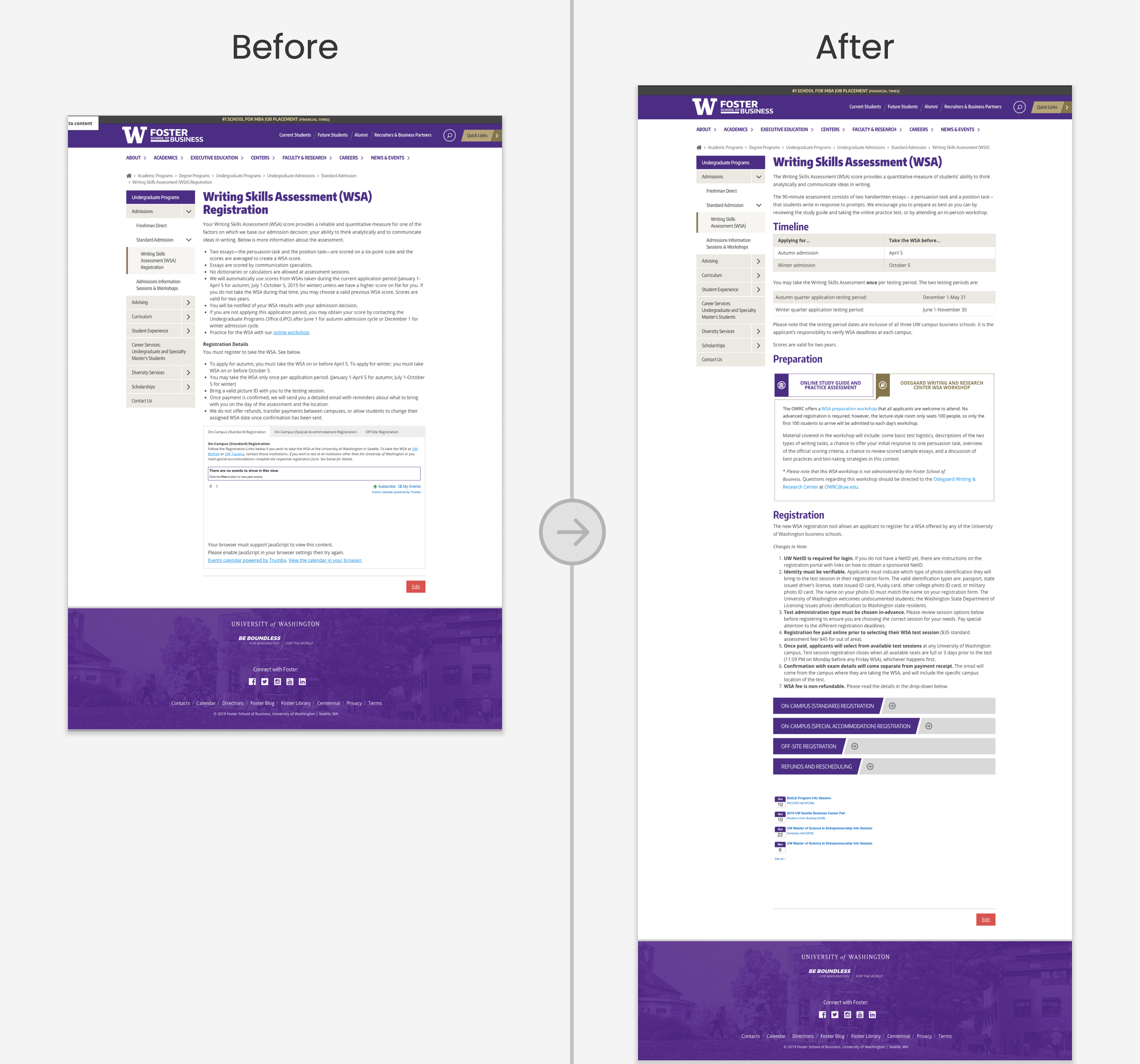
Based on its H1 header, the original WSA page (below) positioned itself as the registration hub for prospective students. However, upon reviewing the content, it became clear that the page merely provided instructions about how to register and external links to the university's registration portals. A technical coding error in the registration widget at the bottom of the page prevented these links from displaying properly, creating the appearance that no registration dates were available. This design flaw left users unable to complete the process, with no guidance on next steps, resulting in user frustration and an increase in support inquiries to the admissions team.
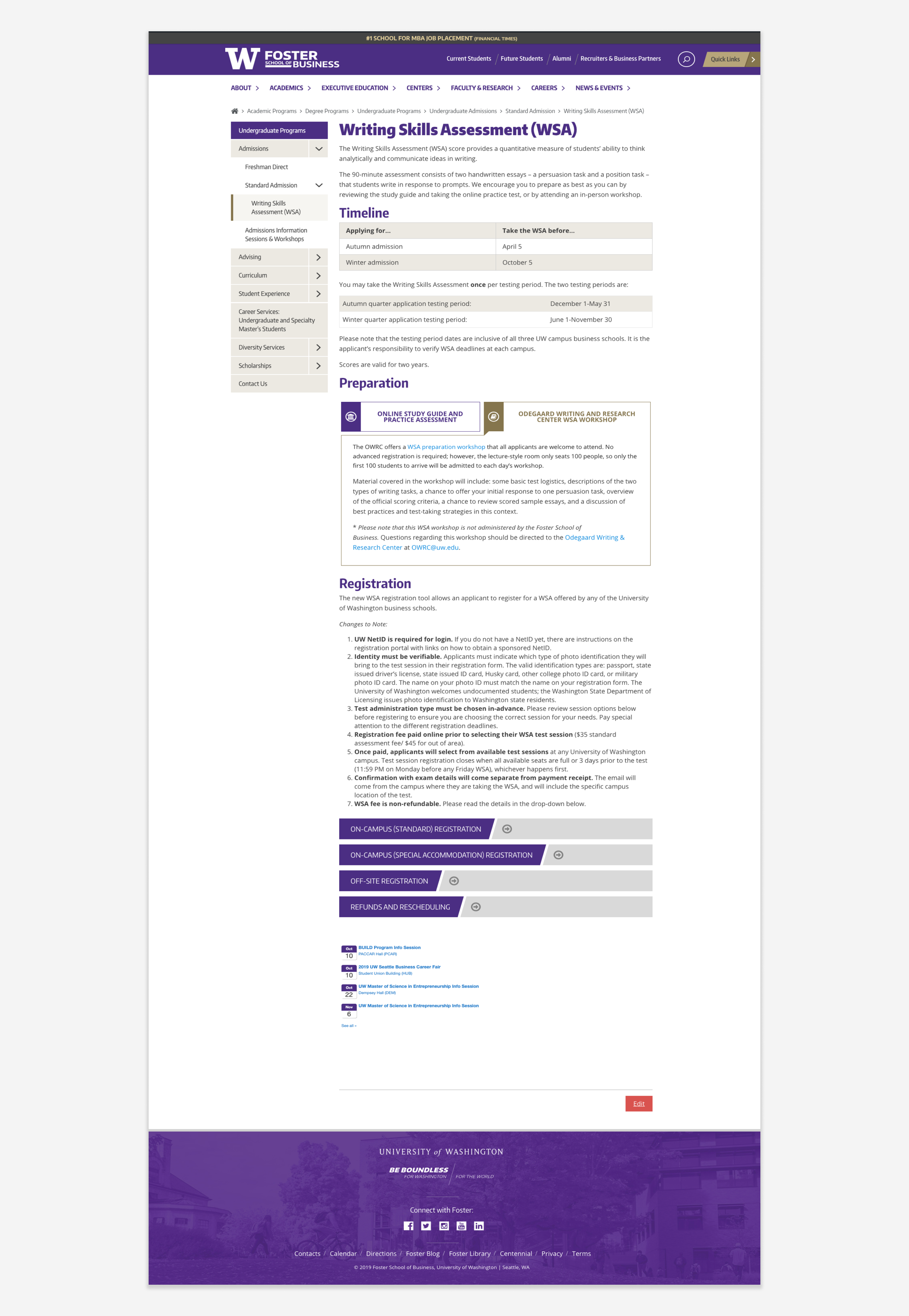
The redesigned WSA page (below) was reimagined as a resource and information hub, tailored to meet the needs of prospective students looking for guidance about how to prepare and register for the assessment. The H1 header was updated to align with the proper intent of the content and set accurate expectations for the user. Content was restructured to follow the logical sequence of steps prospective students typically take to complete the registration process. Preparation and study resources were prominently featured, with carefully crafted microcopy to ensure clarity and alignment with the materials provided. Technical issues in the registration widget were resolved, and all links to the university's registration portals were consistently made available.
Results and Impact
Through a strategic content redesign, the WSA page delivered measurable improvements in user experience and operational efficiency. These changes addressed key challenges and created lasting benefits for both students and staff.
Reduced inquiries by 65%: After implementing the updates, the Admissions team reported a significant drop in questions related to WSA registration, allowing staff to focus on higher-priority tasks.
Enhanced user engagement by 25%: Analytics showed a measurable increase in page interactions, with more users successfully completing key tasks such as locating registration options.
Streamlined operations for scalability: By addressing critical user pain points and aligning web content with audience needs, the updated page created a scalable communication framework that benefitted both prospective students and staff.
Lessons Learned
Through this project, I gained valuable experience in data-driven decision-making by combining user research with web analytics to identify actionable insights and measure the success of content changes. I also strengthened my ability to communicate effectively with stakeholders, advocating for content and design improvements by presenting informed recommendations and addressing concerns through active listening. Additionally, navigating a complex registration system with external constraints reinforced my adaptability and problem-solving skills, allowing me to develop user-centered solutions within existing limitations. If given the opportunity to revisit this project, I would additionally prioritize conducting keyword research to further optimize web copy and improve search visibility.